Say hello
Ometria - 2023
Unit design system
Ometria - 2023
Unit design system
Ometria - 2023
Unit design system
Ometria has gone through significant changes in the last decade, with each new feature introducing new designs and styles that lack consistency without a proper system. The company realised that its UI was outdated and required a modern and sustainable approach to revamp and maintain the design moving forward.
Role
Led the creation of a component library and setup documentation for process and components.
Team
3 Product designer
4 Developers
Approach
A working group was created to bring this project to the platform. I held workshops with the group to formalise naming conventions, documentation structure and ensure alignment throughout the process. I created a plan for the first phase of components in Figma, which we aimed to deliver in 8 weeks. To ensure consistency, guidelines and processes were set for the team to follow after the first phase was complete
Created by Kwong
Created by Kwong
Created by Kwong
Understanding where we are
Before creating a design system, we needed to review the existing Figma libraries and what had been implemented on the platform. The first step was to look at the existing Figma component libraries revealing that there were two different styles. The next step was to conduct a comprehensive audit of the entire platform. I documented every component in a Notion database, grouped into atoms, molecules and organises and tagged them by category. This allowed me to understand which components would need consolidation and the scale of inconsistency between the Figma component libraries and the components implemented on the platform.
Understanding where we are
The first step was to look at the existing Figma component libraries revealing that there were two different styles. The next step was to conduct a comprehensive audit of the entire platform. I documented every component in a Notion database, grouped into atoms, molecules and organises and tagged them by category. This allowed me to understand which components would need consolidation and the scale of inconsistency between the Figma component libraries and the components implemented on the platform.
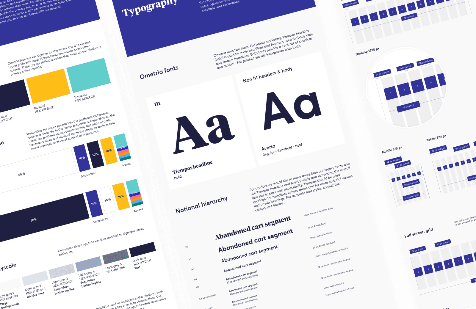
Addressing the inconsistencies
The design audit showed the importance of consistency in the new design system, as there wasn’t an approach for handling typography, colours and spacing, which resulted in difficulty maintaining styles and using the appropriate ones during design.
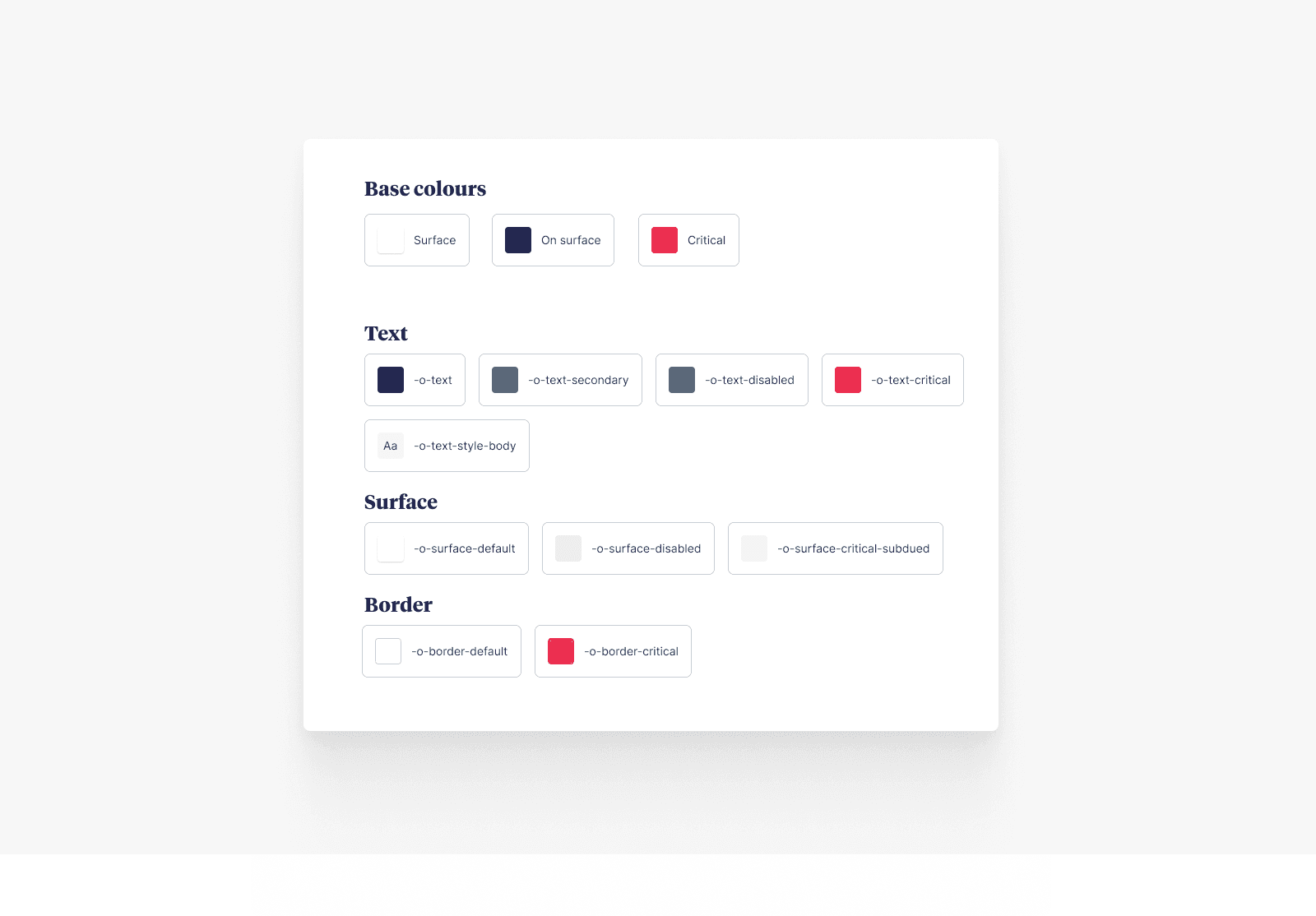
To address this issue, I introduced design tokens to simplify the management of the library and the use of colour styles. I established a set of naming conventions to guide the initial design tokens and any future ones. The aim was to create tokens that were easily understandable at a glance, we use these for type styles, spacing, shadows and border radius.
To use colour in the platform, we adopted the colour role approach of Shopify's Polaris, naming colours according to the UI element they relate to, their colour role, and the interaction state they represent. We applied this structure to the excellent visual design work by Kwong, making it easy to achieve WCAG 2.1 compliant contrast ratios throughout the interface.
Addressing the inconsistencies
The design audit showed the importance of consistency in the new design system, as there wasn’t an approach for handling typography, colours and spacing, which resulted in difficulty maintaining styles and using the appropriate ones during design.
To address this issue, I introduced design tokens to simplify the management of the library and the use of colour styles. I established a set of naming conventions to guide the initial design tokens and any future ones. The aim was to create tokens that were easily understandable at a glance, we use these for type styles, spacing, shadows and border radius.
To use colour in the platform, we adopted the colour role approach of Shopify's Polaris, naming colours according to the UI element they relate to, their colour role, and the interaction state they represent. We applied this structure to the excellent visual design work by Kwong, making it easy to achieve WCAG 2.1 compliant contrast ratios throughout the interface.
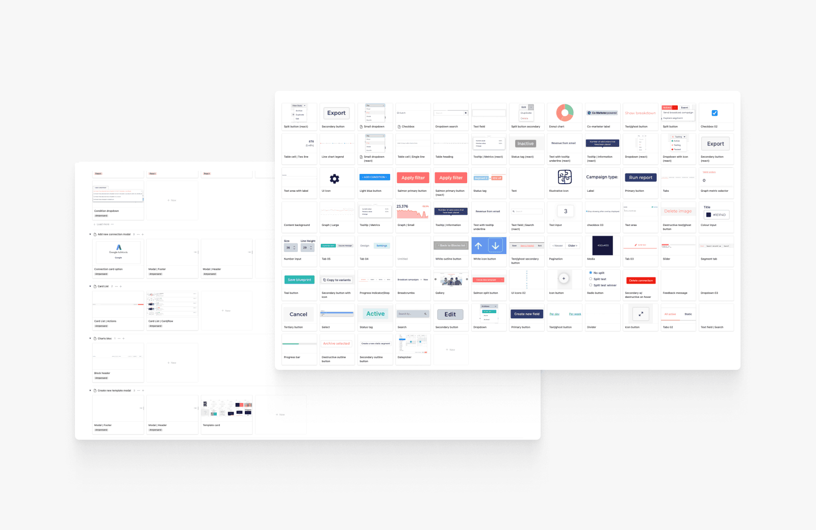
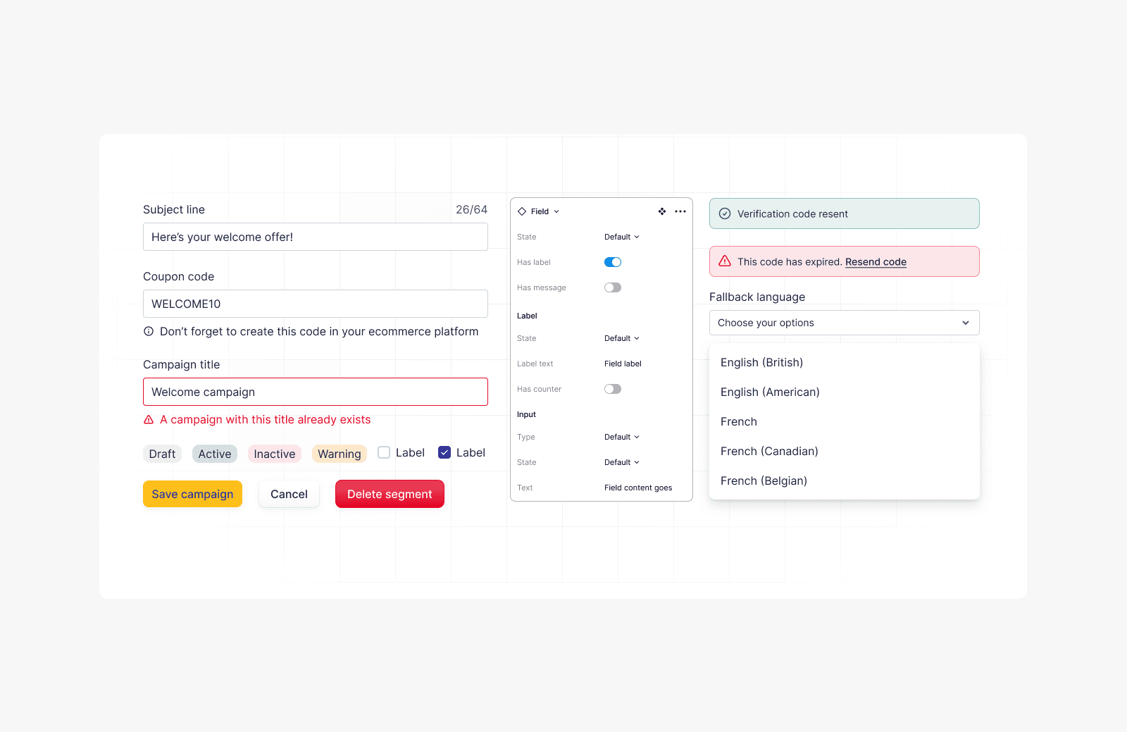
Build for discoverability
When I began building the new components, I wanted to create flexible components with fewer variants. However, when I presented my initial set of components to the design team, it was clear that this approach was wrong. The team felt it made the components difficult to find and complicated to use. However, when I presented my initial set of components to the design team, it was clear that this approach was wrong. The team felt it made the components difficult to find and complicated to use.
To fix these issues, I switched focused on making the components more discoverable and user-friendly for the design team. To do this, components were broken down into smaller sets and built using a consistent structure with component properties. The changes made it easy to find components in the assets panel and for designers to work with components in their designs.
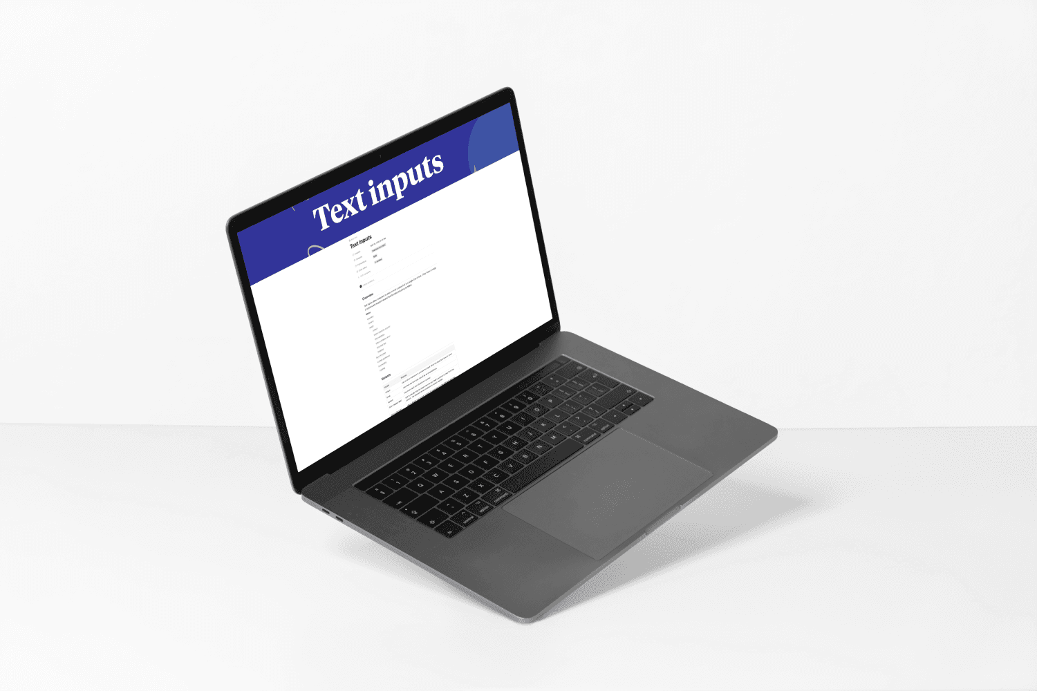
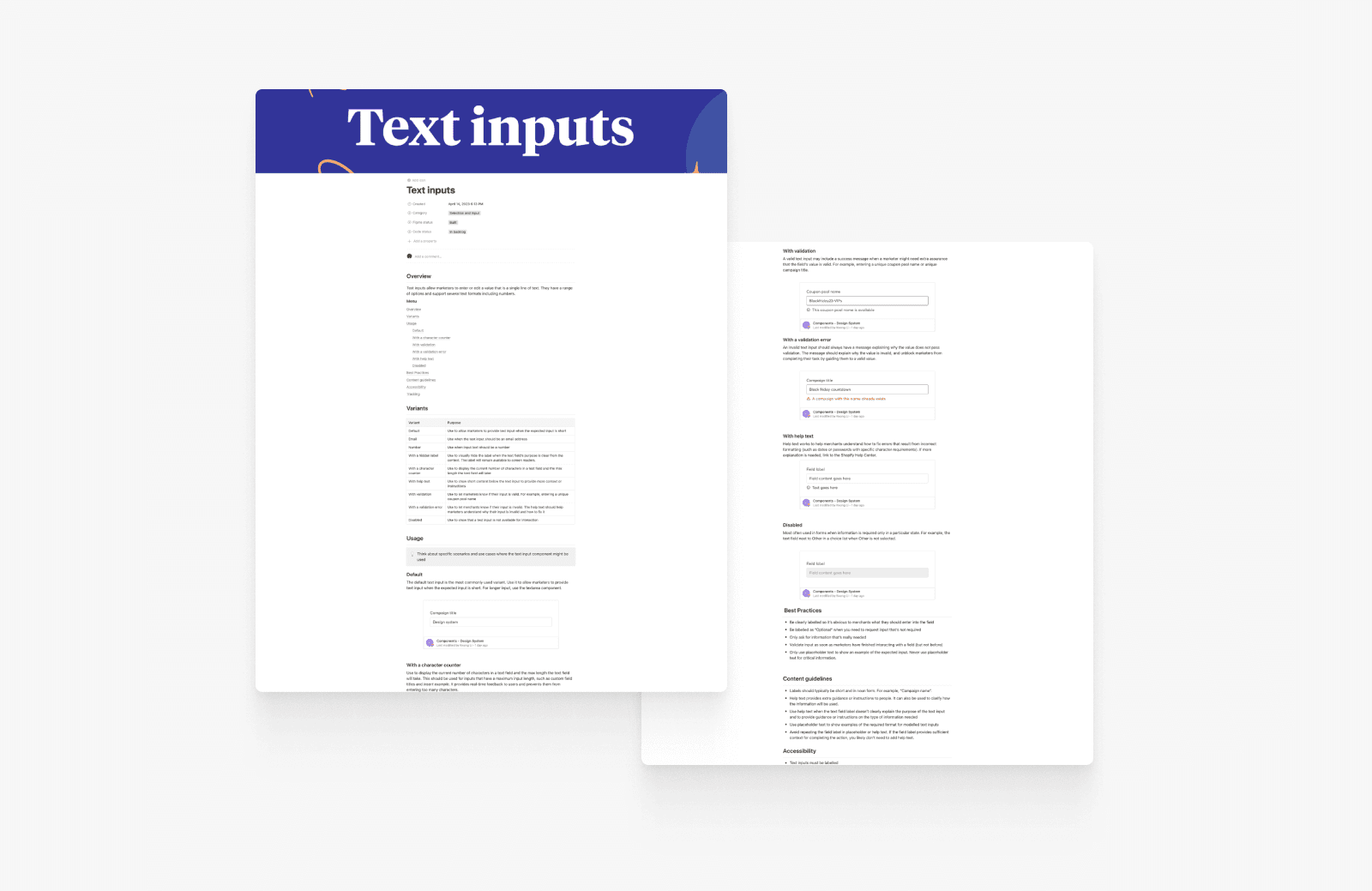
Documenting the approach
The final piece of the puzzle was to create documentation on component usage. The goal was to develop an approach that provided sufficient information on when and how to use a component without making the documentation process overwhelming.
The first step was to research other design system documentation structures to understand the different approaches. This allowed me to create a proposed structure and to have additional sections that I wanted to discuss with the working group.
I held a workshop with the design system working group to agree the documentation structure. We walked through the proposed structure and voted for the sections to include resulting in structure appropriate for our design system's stage, which would enable the documentation to evolve as the design system developed.
Results & impact
Unfortunately my time was cut short on this project, but there was significant progress made to lay the foundations for the design system at Ometria.
Created the foundations for a design system
A core set of components are ready to use. Design tokens and documentation guides are in place for new components to be added.
Aligned cross-function team on key principles
The collaboration and activites in this project allowed everyones idea to be heard and bought into its success
© 2023 Joe Williams. All Rights Reserved.
Back to the top
Results & impact
Unfortunately my time was cut short on this project, but there was significant progress made to lay the foundations for the design system at Ometria.
Created the foundations for a design system
A core set of components are ready to use. Design tokens and documentation guides are in place for new components to be added.
Aligned a cross-functional team on key principles
The designers and frontend engineers are bought in on the
Improved ways of working with designers and frontend engineers
The activities asdd
© 2023 Joe Williams. All Rights Reserved.
Back to the top
© 2023 Joe Williams. All Rights Reserved.
Back to the top